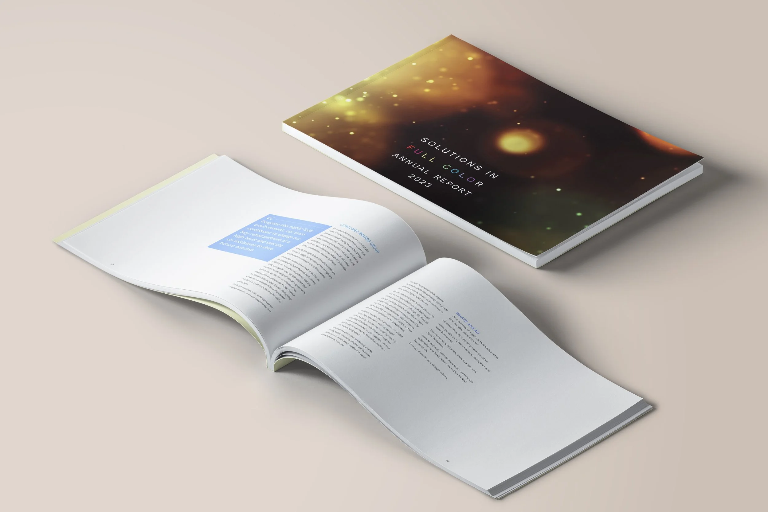
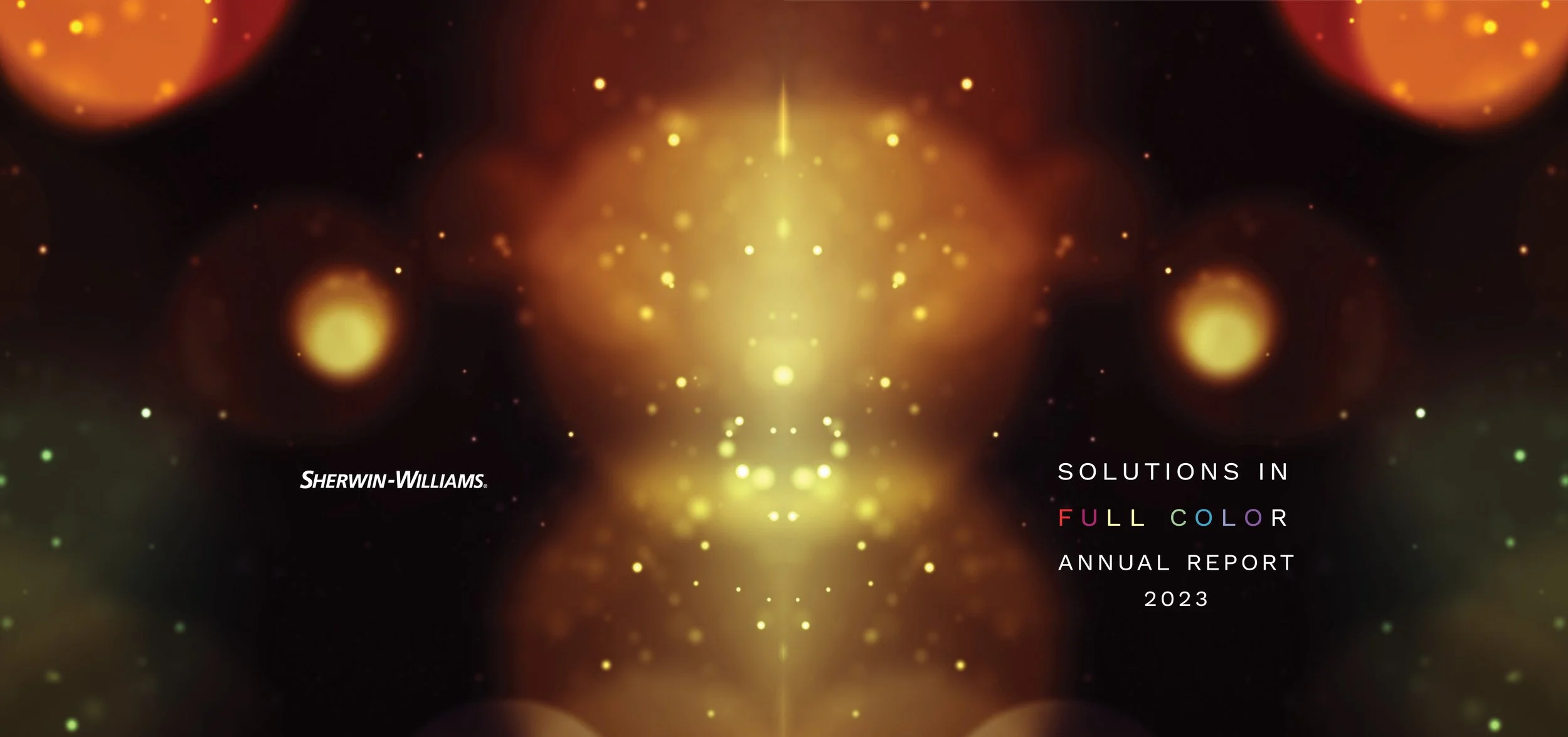
Sherwin-Williams is a company with a multitude of businesses and many different products that they sell globally. This established brand re-design require a large amount of flexibility to begin working on. Their typical style is quite maximalist and built on the blocking out of loud primary colors. Their logos and type treatments often vary from section to section and I saw the opportunity to create uniformity,
I began my process by compiling high resolution images that displayed brilliant colors in their abstraction. I simplified their type variations into a single multi-weight sans-serif family and began to build a clean layout using their information and the numbers derived from their sales reports. This consistency provided a stable backbone for me to explore asymmetry and a unique approach to displaying their color rich business model.